ETL Summary:
A Jupyter notebook was used to clean the original data set. Once the file was loaded to the notebook, the data was put into a Pandas dataframe. Each input variable was inspected for any missing data. If a row was missing an input, the row was dropped from the dataframe. This created a dataframe with 13 input categorical and numerical variables with one categorical output variable indicating if the patient was healthy or sick with heart disease. The cleaning process condensed the original file from 303 entries down to 296. This cleaned data was then saved into a new csv file for reference.
As part of the ETL process to develop machine learning models, the 13 different input variables were evaluated through several feature selection techniques to better understand their potential influence to determining the output variable if someone was healthy or sick.
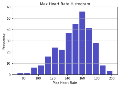
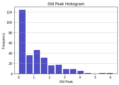
First, the numerical inputs like age and maximum heart rate were plotted on a histogram to understand if any of the input data in the full data set was skewed. The only numerical input variable that appeared skewed was “old peak” which refers to a finding on an electrocardiogram related to ST depression induced by exercise. The majority of patients have an old peak value of 0. It is not possible to have a negative old peak value, which makes the histogram appear to have a right skewed distribution. Overall, the numerical inputs did not appear to be inappropriately skewed.


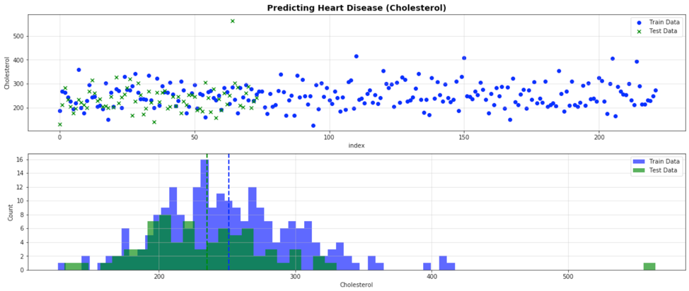
As a next step, the full data set was split into train and test data sets using the SciKit-Learn “train_test_split” function. A random seed of 42 was used to prevent splitting the full data set into new groups each time the notebook was run. To verify the test and train data was stratified appropriately, the numerical inputs of the test and train data were plotted against one another to ensure they overlapped and nothing was skewed due to the random splitting of the data. Graphing the data demonstrated the test and train data overlapped nicely on each other with the test data making up a smaller subset of the full data set.

Figure 2. An example of graphing the split test and train cholesterol input data to identify any skewed splitting in the data
ANOVA statistical functions from SciPy were also used to calculate if there was a statistical difference in the means between the test and train numerical input data. Stats such as one-way ANOVA, two-sided T-Test with unequal variances, and Kruskal-Wallis H-Test at 95% confidence intervals were all used for the analysis. The p-value between the test and train populations were compared to determine statistical significance. The majority of numerical inputs had p-values greater than 0.05, which implies there was no statistical difference between the means of the test and train data. The one exception was cholesterol, due to a potential outlier in the test data that has a patient with cholesterol above 500 (see Figure 2). Due to the limited full data set, the outlier was not removed from the test data set.
|
Numerical Input |
One-Way ANOVA |
Two-Sided T-Test |
Kruskel-Wallis |
|
Age |
0.703 |
0.720 |
0.687 |
|
BPS |
0.977 |
0.976 |
0.634 |
|
Cholesterol |
0.021 |
0.033 |
0.005 |
|
Max Heart Rate |
0.832 |
0.845 |
0.939 |
|
Old Peak |
0.276 |
0.242 |
0.357 |
Next, SciKit-Learn feature selection functions were used to evaluate the importance of the different inputs. In order to use these functions, the data had to be treated in the way the team wanted to analyze the data with the models. Therefore, a function was created to split, encode, and scale the data as it would be used for the models. As mentioned previously, the “test_train_split” function was used with a random seed to split the full data set. Numerical inputs were scaled with the MinMax scaler function from Sci-kit Learn, while categorical input data was encoded using Pandas get_dummies function. Next, the categorical output data was encoded with the Sci-Kit Learn LabelEncoder function. Finally, the test and train inputs and output variables were saved into separate csv files for the models to use.
The first Sci-Kit Learn feature selection function used was the SelectKBest function; a univariate chi-square analysis which is used to identify significant input features based on univariate statistical tests. As an input to the function, “chi2” was called out to apply chi-squared statistics to the data set, since the output is categorical. The return values were ranking scores from highest to lowest of the input data. Because the categorical inputs were encoded, each option for one categorical input variable was given its own score. For example, the “thal” input had the choices of “rev”, “norm”, and “fix”. “Thal_rev” ranked high with a score of 34.2, while the “thal_fix” ranked low with a score of 0.74. Overall, the most unintuitive result was cholesterol, which ranked near the bottom. Common sense would make the average person assume cholesterol to be a more significant contributor to heart disease.
Table 2. Chi-Square Score Rank of the Input Features
|
Input ID |
Specs |
Score |
|
27 |
thal_rev |
34.200294 |
|
17 |
exerciseInducedAngina_true |
33.418728 |
|
9 |
chestPain_asympt |
32.604218 |
|
26 |
thal_norm |
28.482451 |
|
21 |
vesselsColored_0.0 |
21.540903 |
|
20 |
slope_up |
18.872001 |
|
19 |
slope_flat |
15.823077 |
|
16 |
exerciseInducedAngina_fal |
14.756322 |
|
7 |
chestPain_abnang |
14.126050 |
|
10 |
chestPain_notang |
13.687783 |
|
23 |
vesselsColored_2.0 |
12.695136 |
|
5 |
sex_fem |
12.124316 |
|
22 |
vesselsColored_1.0 |
11.352036 |
|
4 |
oldPeak |
10.745139 |
|
24 |
vesselsColored_3.0 |
7.004118 |
|
6 |
sex_male |
5.700838 |
|
13 |
ecg_abn |
3.529412 |
|
8 |
chestPain_angina |
2.826471 |
|
15 |
ecg_norm |
2.605742 |
|
3 |
maxHeartRate |
1.955725 |
|
14 |
ecg_hyp |
1.548633 |
|
0 |
age |
0.975826 |
|
25 |
thal_fix |
0.741422 |
|
18 |
slope_down |
0.684007 |
|
1 |
trestBps |
0.355538 |
|
2 |
cholesterol |
0.136939 |
|
12 |
bloodSugar_true |
0.022368 |
|
11 |
bloodSugar_fal |
0.004620 |
The next feature selection function used was the Extra Tree Classifier. It essentially applies the same logic as a decision tree in machine learning to determine an importance score to each classifier input. The top 15 inputs with the highest score were plotted in a horizontal bar chart to help visualize their scores relative to one another. Results from this function mirrored those from the SelectKBest function.

Figure 3. Top 15 scored classifier inputs by the Extra Tree Classifier function
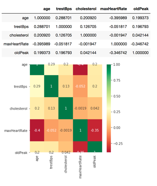
The final feature selection technique used on the input data was a correlation matrix with a heat map to help visualize the results. This technique shows how input variables relate to each other. It helps to identify if any of the inputs are dependent on one another and may be confounded. This technique only works on numerical data, therefore there were only five features in our data set that were evaluated with this approach. The correlation function and a Seaborn heat map were used to create the graph. Overall, the correlations between the tested features are relatively low, with the highest being between maximum heart rate and age at -0.4.

Figure 4. Input correlation results with Seaborn heat map
When deciding what data to include in the machine learning models, the team decided to not eliminate any from the original data set. The original data set that was cleaned for this ETL work had already been paired down by other individuals from a larger set with around 48 inputs.